MyCarbon Trackr
Taking on Your Carbon Footprint, One Trip At a Time
Project Overview
MyCarbon Trackr is a mobile application that helps keep track of your carbon footprint based on your transportation choices.
Project Details
- 2 week duration
- My Role: UX Designer & Researcher
- Solo project
Methods
- Interviewing
-
User Journeys
-
User Flows
-
User Archetypes
- Storyboarding
- Competitive / Comparative Analysis
- Wireframing
The Challenge
Raising Awareness
The challenge that came into focus was how can I help empower individuals to learn more about what their daily transportation carbon footprint is and create new habits that will reduce their CO2 impact.
The Proposed Solution
Changing Our Habits
By shining light on the users transportation habits it will raise their awareness, allow them to make educated decisions and empower them to do their part in tackling climate change.
The success of the application can be measured quantitatively through user engagement and an overall reduction in their carbon footprint.
Initial Steps: Research
Getting To Know The Users
1. Interviews with potential users.
2. Affinity mapping and user personas.
3. Feature prioritization based on insights.
User Interviews
Learning Where the Need Is
Before conducting user interviews, I wanted to ensure that the interview questions that I wrote out would be the most conducive towards gaining the information I was looking for. This proved challenging, as I didn’t want the questions to be leading, or promote any sort of confirmation bias.
The top three things that I wanted to learn during the interviews were:
- What kind of demand is there for the MyCarbon Trackr app?
- How can the MyCarbon Trackr app help reduce any pain points users currently have?
- What are the type of ways users can interact with the MyCarbon Trackr app?
Once I had a framework on the core questions I wanted to explore, I conducted five in-person interviews with a demographically diverse pool of users.
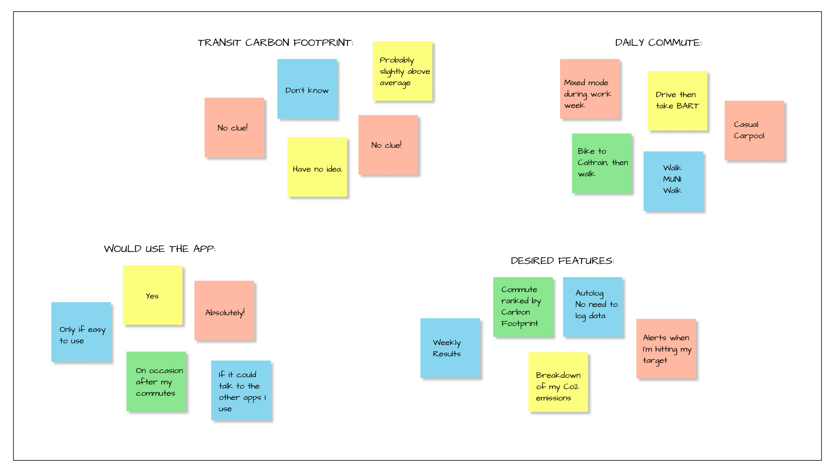
The Results
“I have no idea what my carbon footprint is!”
“I would be very curious to find out what my CO2 emissions are.”
“I would be very curious to find out what my CO2 emissions are.”
“I want something that autologs my commute and does all the work for me.”
Affinity Mapping
Noticing Common Threads
Identifying our target users
Honing in on a Design Solution
After I synthesized the user interview data, I was able to better identify who my target users are, their needs and their pain points. I wove together this information to create several user personas that are strongly rooted in research. Each persona illustrates the motivations, barriers, and needs that different MyCarbon Trackr users could potentially have.


Storyboarding
Weaving a Narrative
Paper Prototyping
Learning Through Testing
For my next step I wanted to quickly iterate some paper prototypes to learn if my design was user friendly and gain insights on how it could be improved. The three tasks I asked users to complete included creating an account, sharing their leaderboard status and viewing their weekly emissions total. All 5 of the users I tested were able to complete all of the tasks without any help or prompts.
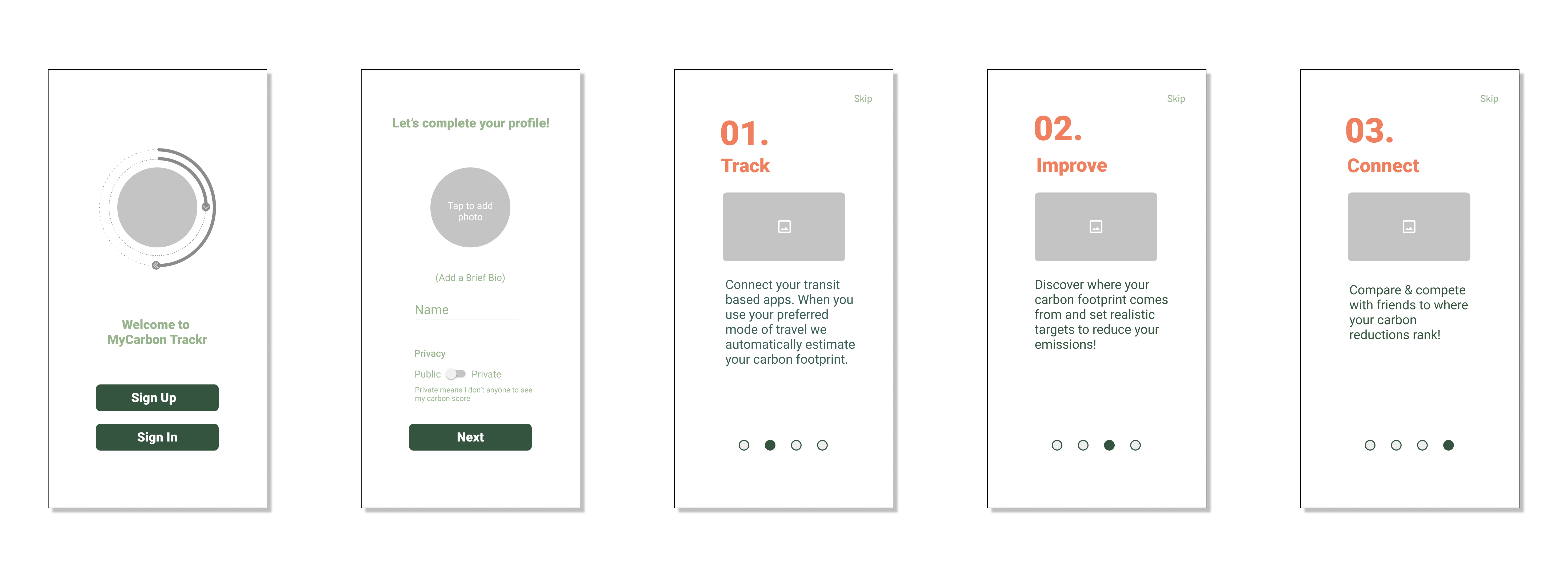
Task 1: Creating an Account

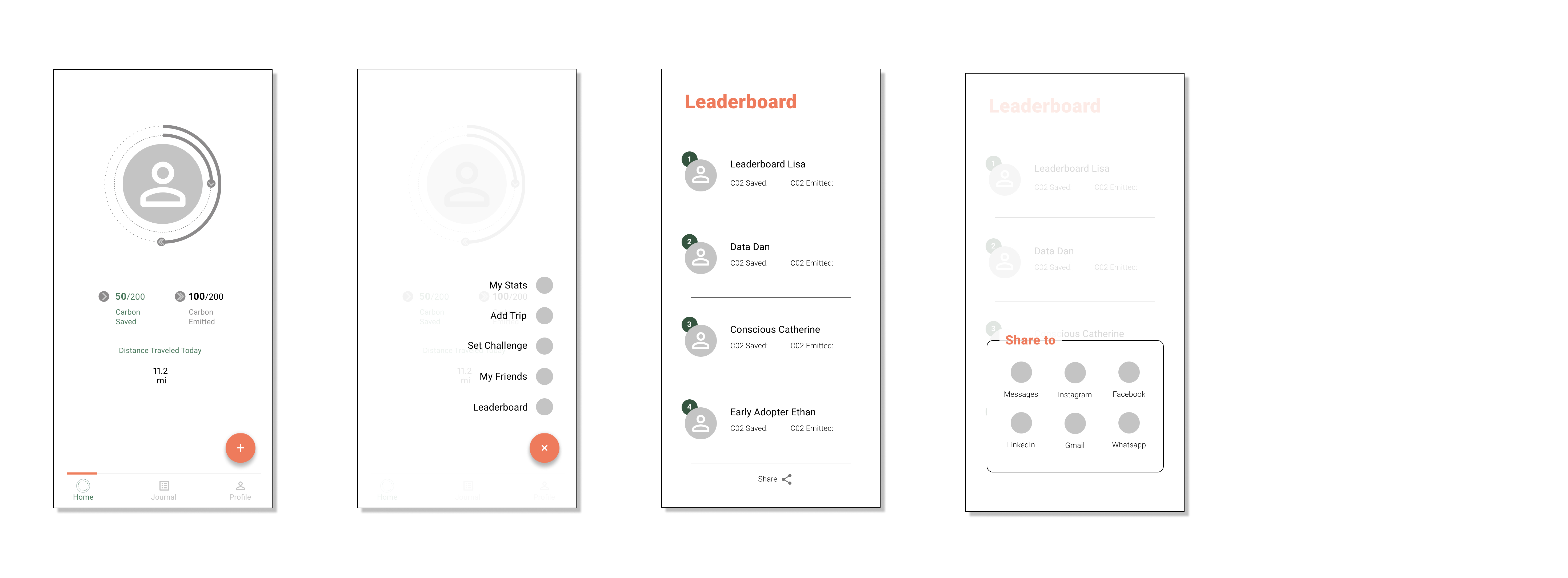
Task 2: Sharing Leaderboard Status
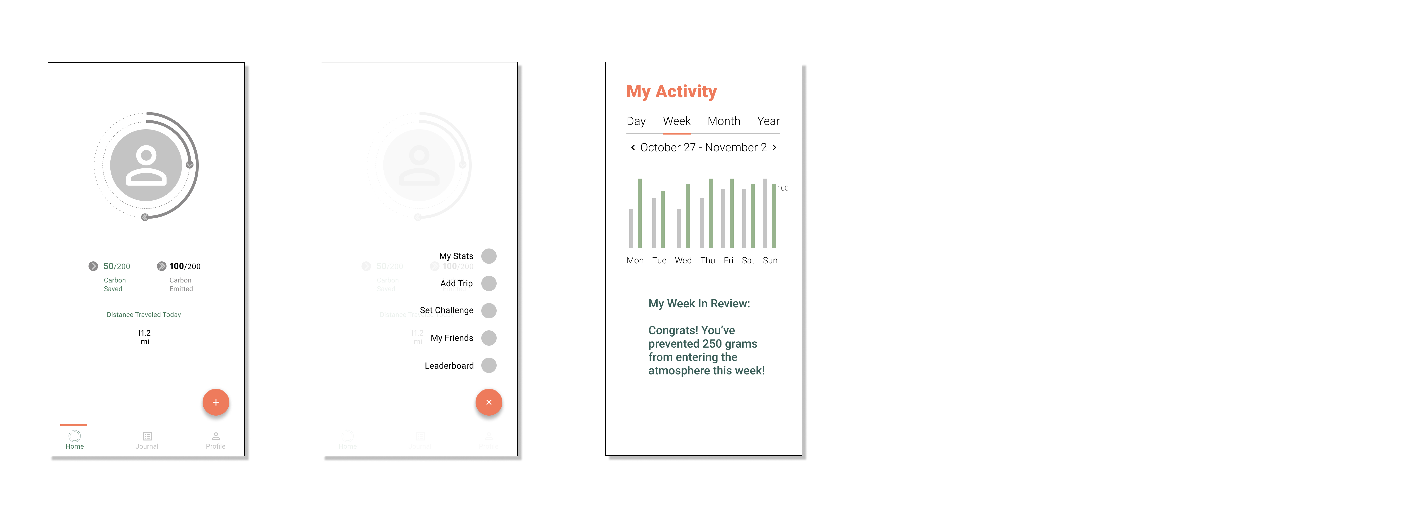
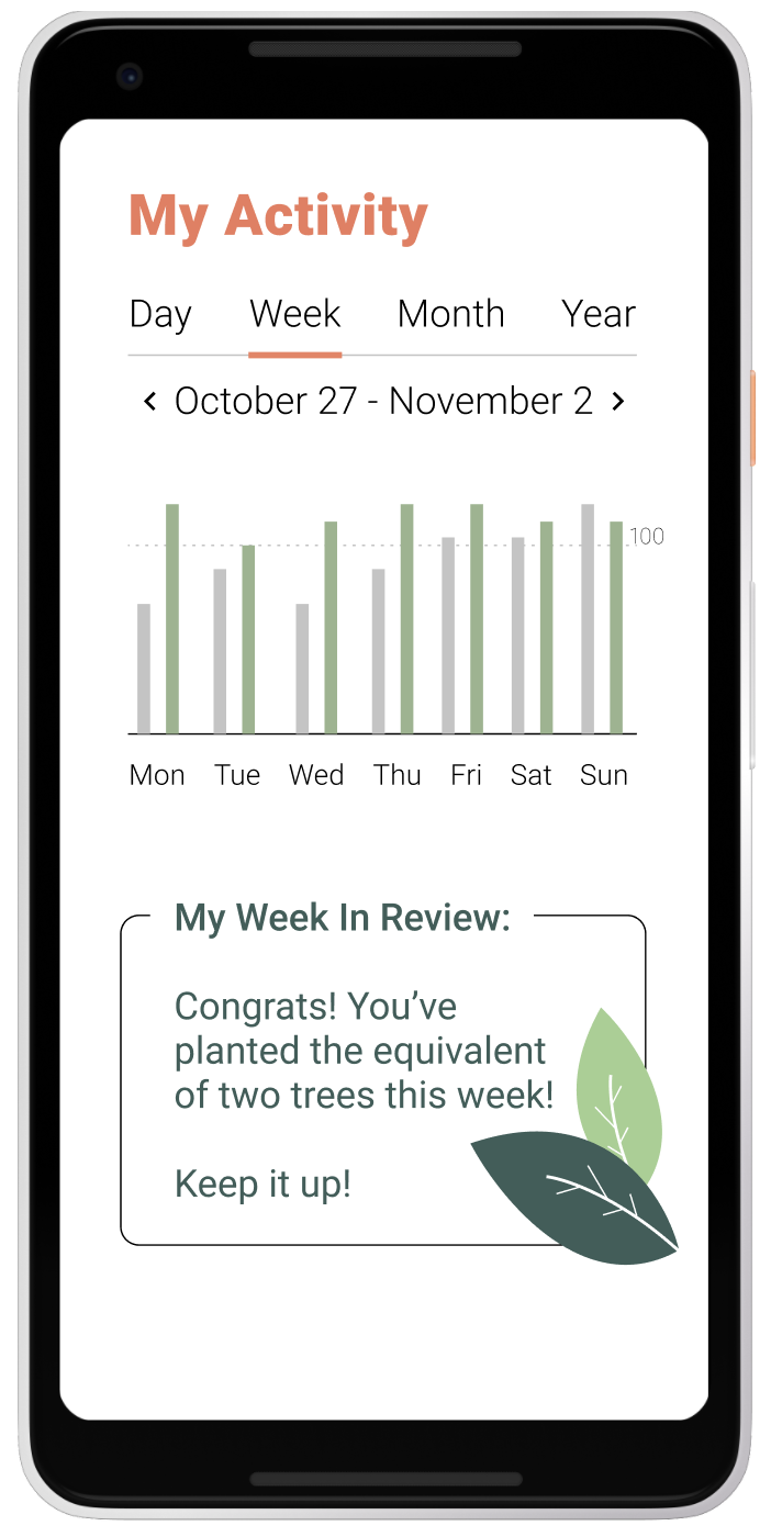
Task 3: Viewing Weekly Emissions Total
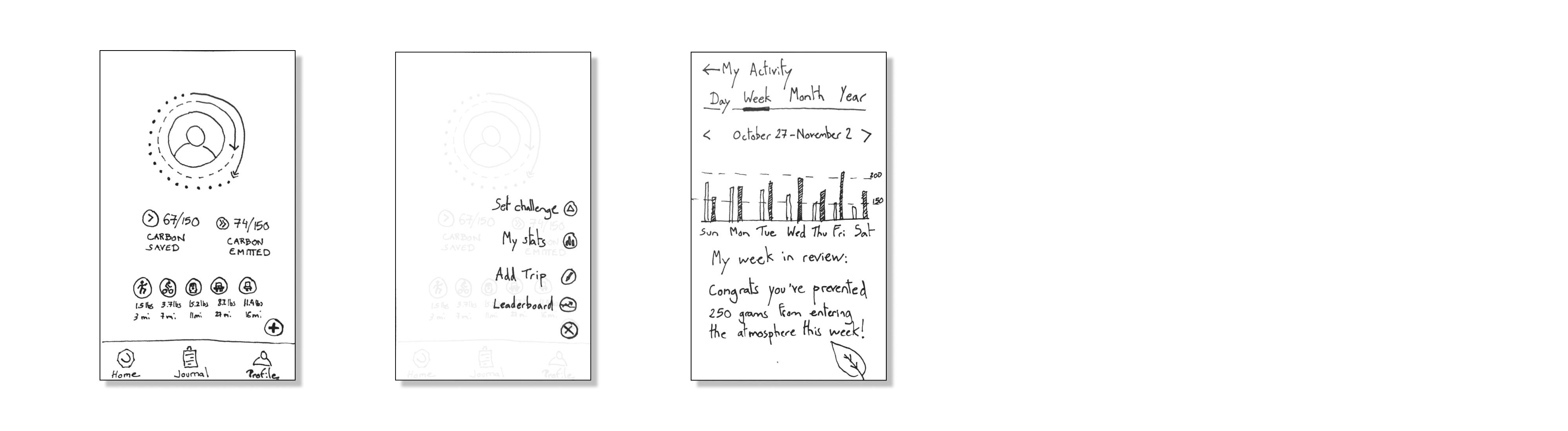
Wireframing
Setting The Design Framework
Task 1
Task 2
Task 3
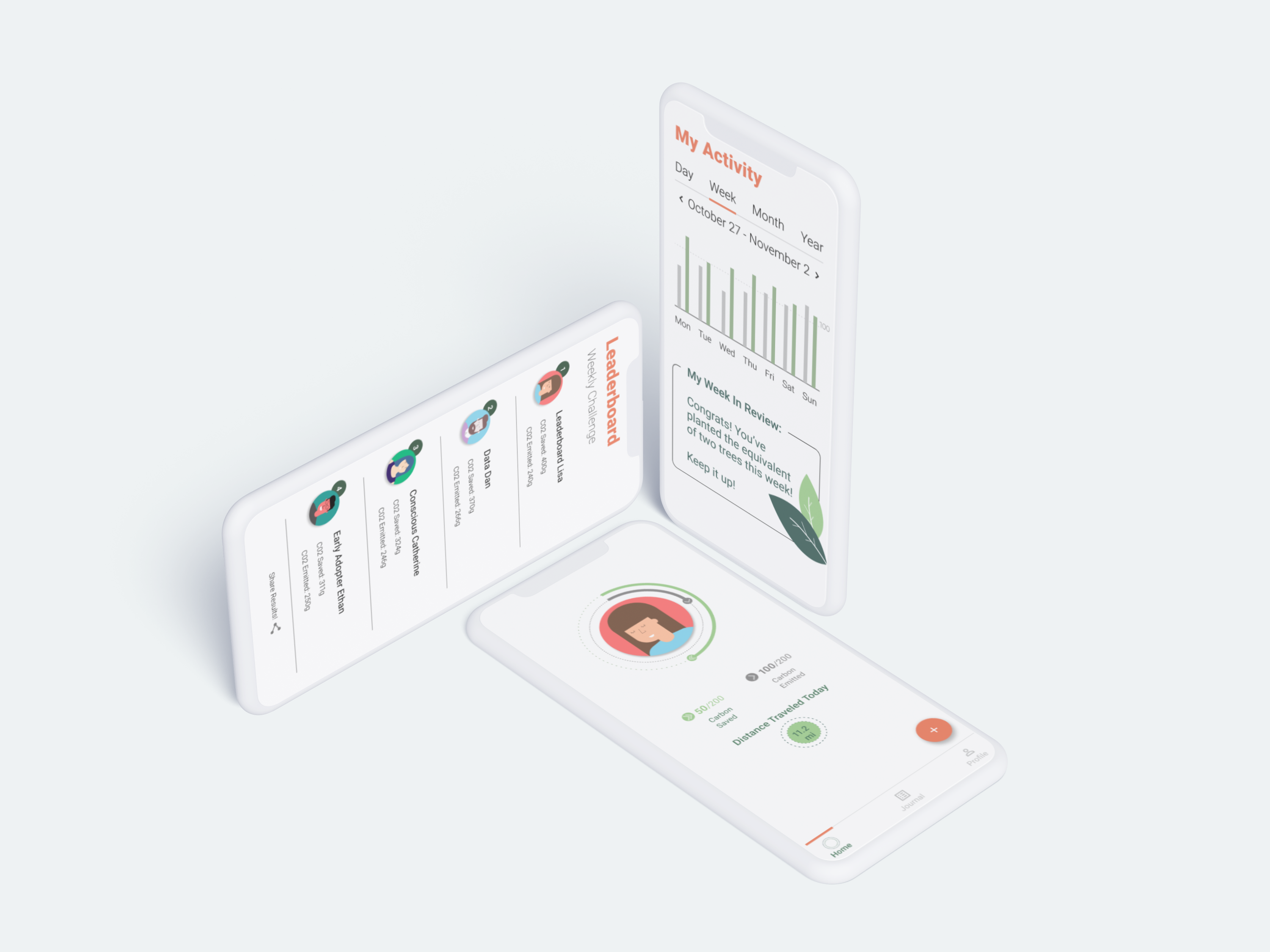
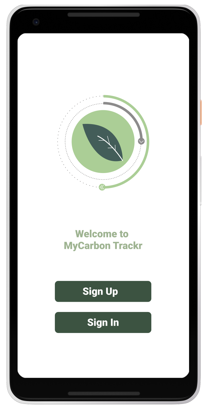
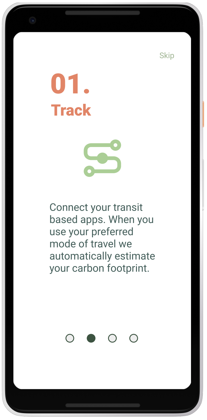
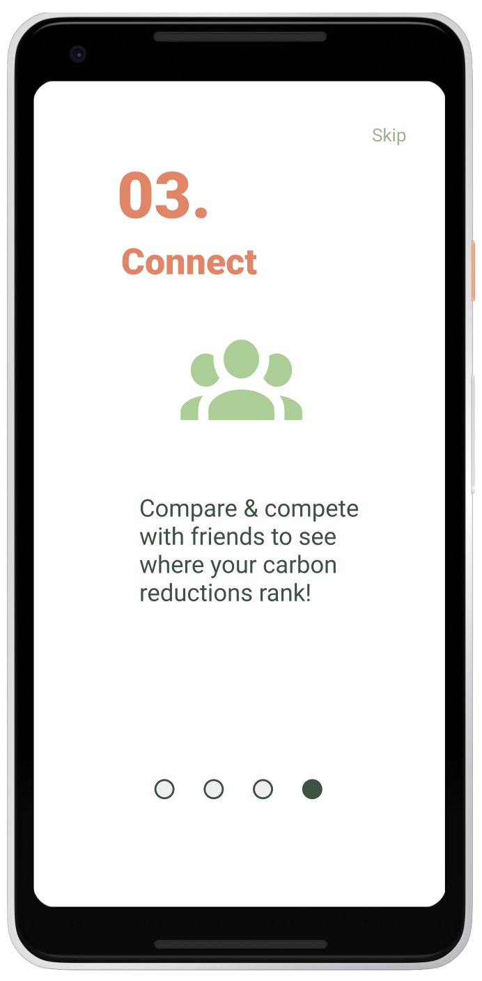
The Design
Cool! How Does It All Look?
Task 1


Task 2
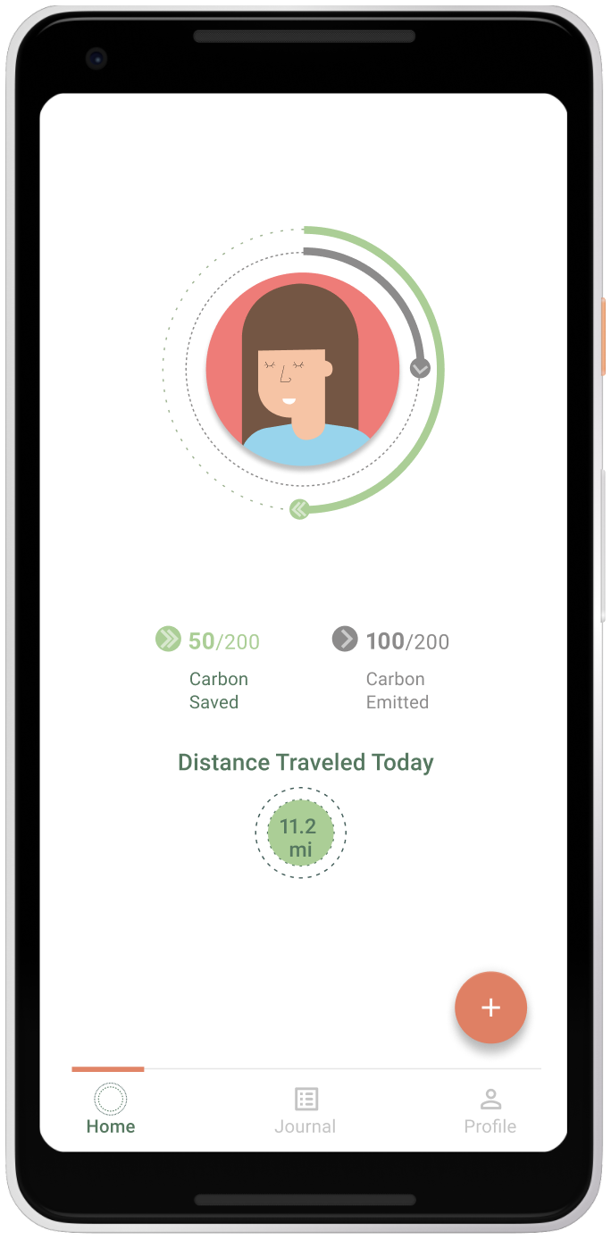
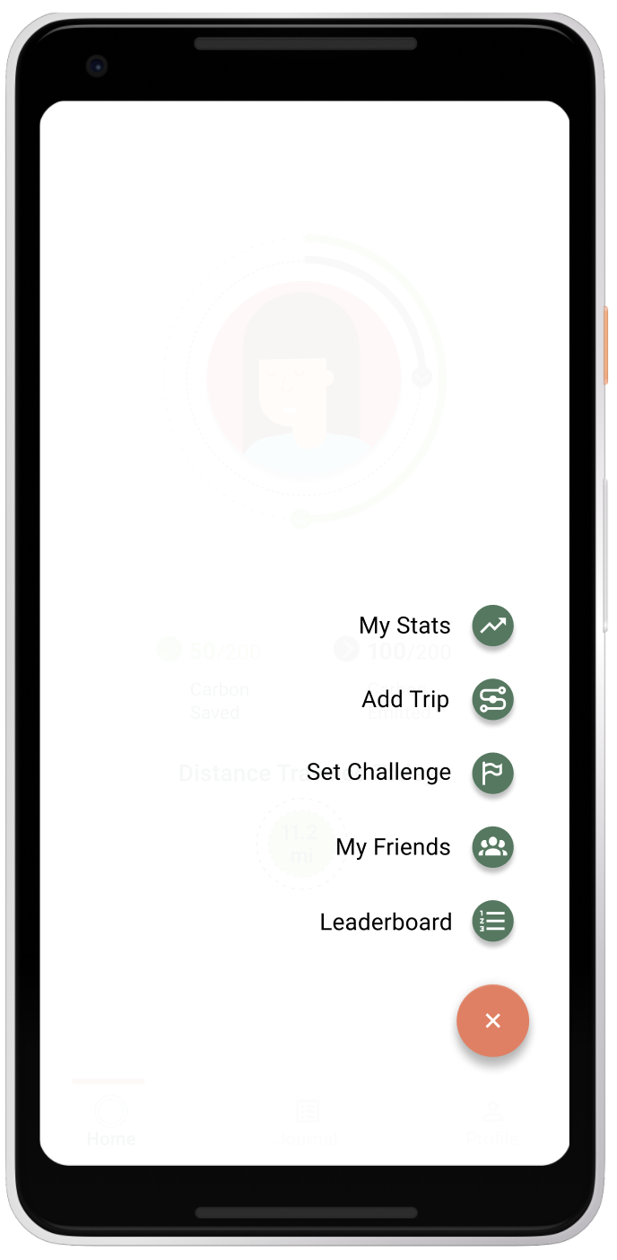


Task 3
Results & Reflections
That’s Great, Now What Does It All Mean?
What emerged from my user interviews, multiple design iterations and rounds of testing was a product that was ultimately far more exciting and comprehensive. The entire design process provided me with some great learning opportunities:
- I (re)learned the obvious, to not get overly attached to your first idea, some exciting things may be waiting around the corner!
- Design, iterate, test and repeat.
- Keep it simple! No need to overcomplicate things!